Spaghetteria
Spaghetteria has 14 locations in Holland and 1 in Berlin, and their homemade pasta factory is in Amsterdam. Our goal was to highlight the simplicity of their brand, their use of the freshest produce, and their homemade fresh pasta made in their factory.
Illustrations:
When we rebranded Spaghetteria, we started using hand-drawn illustrations for the brand to establish its own identity. They are all based on the brand colors, inspired by Italy, and the colors of their main ingredients.


Photography:
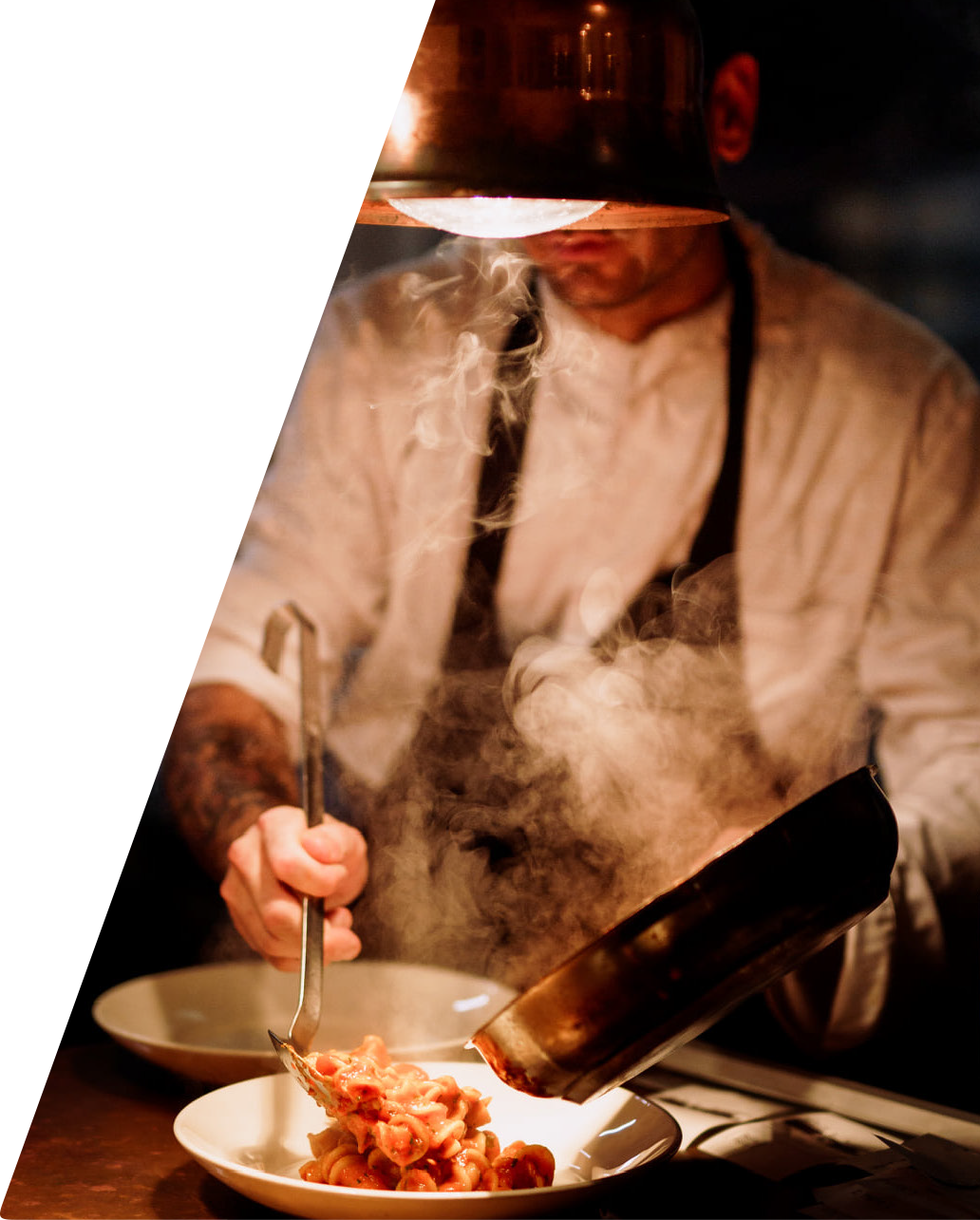
Spaghetteria is about authenticity, and we wanted to show real people and real moments. We wanted to convey the homey and cozy
atmosphere of Spaghetteria through our photography. Capturing our diverse team and customers at candid moments allows the audience
to experience being at the restaurant through the photographs. Bright lighting makes the image look more vibrant and attractive.
Photos of the cooking process show a “behind the scenes” moment, building anticipation for the final product.
Sagra:
An Italian village festival brought to Amsterdam inspired by seasonal produce. Think of an evening with only garlic, truffle, or
basil as a main ingredient on the menu. How we announce the festival every season is essential, we want to bring an enticing atmosphere,
a sneak peek of what the customers should expect from the event.
Merchandise:
For the OG Spaghetteria fans. Artist Paul van Raak designed a line of sweaters, shirts, shorts, and hats with the classic Spaghetteria Lip
logo. The merchandise is available on the Spaghetteria website and in-store in their new concept location Spaghetteria Caffe.


